
Creating the perfect product page for your eCommerce business is an art and a science.
Art, because you have to design an intuitive interface and let your brand personality shine visually. Science, because you have to understand your shoppers’ needs and expectations to create compelling content aligned with your brand values.
Not every brand is able to achieve this delicate balance. That’s why we created this roundup of 13 excellent eCommerce product page examples to inspire you and share actionable tips to transform your pages from meh to mama mia!
Stick with us till the end to find our top practices for creating compelling product pages.
Let’s break down these 13 eCommerce product page examples to help you create the perfect page for your products.
The product page immediately catches your attention because of its unique structure. Half of the hero section includes a high-definition picture of different cookies, and the other half includes product details their target audience would need, like the product description, price, and cookie names.
Unique detail: When you click on any of these cookies, you can see very short descriptions while the cookies shake!
Scrolling down, you'll see a video of how the cookies are packaged in a luxe black box. This is a superb way to create more appeal for your product and nudge online shopping visitors to place an order from your eCommerce store.
The page humanizes the brand by mentioning the back story of how the collection was created. Paired with high-quality product images, this minimally aesthetic page ends with three FAQs about shipping timelines, shelf life, etc.
The Last Crumb's product pages lean heavily on their distinctive visual style. With high-quality images and creative descriptions, the page makes you crave these cookies. A good UX element is the pricing and add-to-cart banner, which is readily available as you scroll up and down the page.
In the hero section, you can see a carousel of product photos—a mix of infographics and customer pictures. The right side shares more details like the product flavors, pricing, protein quantity, and customer rating.
This page is unique in that it ditches the usual product specifications and covers two important details: who this product is for and excluded ingredients. The No-No List helps prove the health considerations of this protein supplement.
The usage instructions and reasons to try this product also build trust among visitors and help them make an informed decision. This is followed by a long list of FAQs to answer all possible customer questions and reduce any uncertainty regarding the solution.
This product page by Cosmix includes a video by the brand’s co-founder to add a personal touch for visitors. It also includes details that directly handle people’s objections and set them up to try the product immediately. By sharing essential details up top and including helpful instructions, this page encourages visitors to buy the product.
The page starts with a banner calling this product an exclusive release. It includes a catchy product title and a short description with three key attributes. The reviews add more credibility, while the buying options simplify the decision for new/existing customers.
Unique detail: This product page has two cool elements—one, a 100% refund guarantee, and two, a 'call it magic' callout box.
The first element is intriguing because interested shoppers can place an order without worrying about the taste. It also shows the brand's confidence in its product. The second element shares a BTS detail to convince you about its effectiveness.
The rest of the page includes thousands of positive reviews and ends with an FAQ section. What's unique about this part is the helpdesk option. You can chat with Javy’s customer support agents to learn more about this coffee.
While this is a fairly short page, it gives you everything you need to offer a seamless online shopping experience. From instructions on using the coffee to the ingredients list, this page convinces you to buy the product without taking too much of your time.
The page opens with a bold sentence on the product image. It draws you in to swipe and scroll to learn more. The entire page is written in first-person style from the perspective of the product. In addition to the product photos, it includes a before-after comparison of people who used this body scrub. This instantly builds social proof!
You'll also find a good upselling option—buy a body lotion along with the scrub. The 'inside me' section includes the ingredients list, while 'how to use me' shares step-by-step instructions for using the scrub.
This product page also includes a 30-second video on how to use the product. Besides reviews, it shows related products to buy from your eCommerce store and ends with a link to a magazine article featuring this product.
Frank Body's unique visual style sets it apart from the crowd. The first-person narrative is a nice touch, while the before-after pictures convince their target audience about the product's effectiveness.
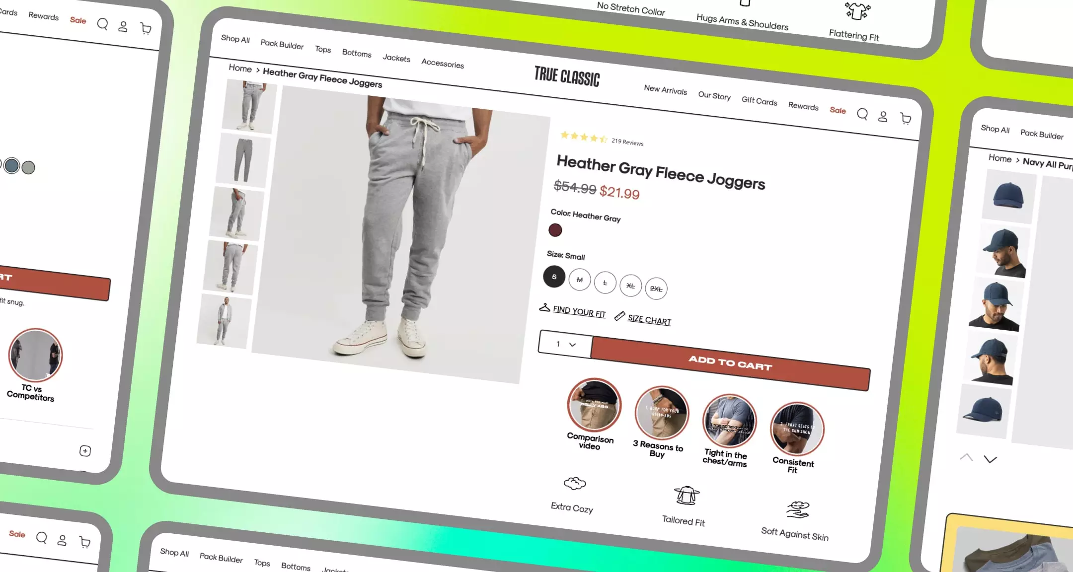
This page opens with a collection of product images on the left and specific details on the right. The right panel includes a long product description along with the product price and ratings. This is followed by the color and size options.
As you scroll down, you can see a couple of shoppable videos explaining the product in more detail. After this section, you'll see customer reviews and then a set of FAQs, along with another video showcasing this item in action.
This example shows you the impact you can create by embedding shoppable videos on your product pages. It communicates everything about the product—usage instructions and care guidelines—with visual detail.
Pro tip: Use a powerful video commerce platform like Videowise to turn a video into a shoppable format and embed them anywhere, including your product pages. Book a demo to learn more!
The page opens with a plain hero section showing a product image, ratings, size, price, and description. As you scroll down, you'll find more information about expected results, benefits, and ingredients.
Interestingly, the ingredient list emphasizes the benefits and shows exactly which ingredients in the product will help in achieving these benefits. This page also includes social proof with a set of four before-after visual case studies.
You'll find a short video on how to apply this product, along with the best routine. Notice how this routine includes recommendations for other products by d'you—cool upselling trick! The page includes FAQs and callout quotes from customers, followed by reviews.
The visual structure can make or break your page, and this example proves that. It includes a combination of photos and videos in a neat product page layout to persuade anyone who visits this page. The ingredient list is a great touch too!
This page shows a high-definition video of the product and shares some of its main value propositions. It also includes a “pairs well with” section to instantly upsell potential customers.
You'll find all the necessary information on the right, with product images showing it in action. The page also gives a shout-out to three famous chefs who helped in designing this wok—building credibility for its effectiveness.
The rest of the page includes recipes, FAQs, reviews, and a detailed care guide for this product. The ‘customers also loved’ section shares some recommendations to check out other products.
Unique detail: Along with pictures, you'll also see an option for "click to unbox." This interesting button shows you an unboxing video about the product's packaging and size.
As one of the best minimal product page design examples, this page justifies the idea of less is more. Without too many design elements, this page wins people’s trust by spotlighting the makers of this product, sharing an unboxing video, and giving away a detailed care guide.
This product page tells you all the essential product details—rating, colors, size, and price—as soon as you land here. The image carousel on the left includes photos from actual customers and a 30-second video showing the socks in real life.
The page reduces friction for site visitors by adding this right under the Add to Cart button. You can learn more about their exchange/return policy, satisfaction guarantee, and payment options.
Further down the page, you’ll see lots of videos showing the socks in action. The page also includes a description of how these socks are designed. The best part? There’s an entire section dedicated to customer testimonial videos—talk about social proof!
Even with its minimal design, this product page stands out because of its quality of content. By showing the socks in action and including genuine reviews from customers, Apolla gives buyers enough reasons to place an order.
This page shows a high-definition product photo and the name in a big font. Unlike traditional pages showing a description, this page includes a brief customer review. It also creates a sense of urgency with a small tag for "final sale." The "Shop the Full Look" option is a great opportunity to upsell!
The product page includes other crucial product details like its fabric, fit, care instructions, etc. You can see more products related to this one at the end of the page.
This page gives the eCommerce site visitors as much information as possible without overwhelming them. Its classiness aligns with the brand’s personality. Instead of adding an FAQ section, the page gives you a live chat option to clarify your doubts and place an order.
This page includes a neat product photo and the many color combinations you can choose from. It gives you a snippet of the description and a small section on the reasons to buy this item. Scrolling down, you’ll find essential details about the product—dimensions, materials, delivery options, etc.
A section showcasing its origin story and a shout-out to the designer is other cool feature of this product detail page. You'll find a selection of articles to style this product and a section on similar items to browse.
This page is a great example of how to incorporate multiple elements in a single product page. While you can use the first half of the page to share crucial product details that buyers look for, you should dedicate the rest of the page to adding more context around the product.
As soon as you land on this page, you know it’s not one of the typical product pages. Its unique image carousel and minimal details in the hero section invite you to scroll down (or left) and learn more. When you click on the tiny arrow near the description, you’ll get more insights about this item.
This short page includes four quick info items and another slider to share relevant recommendations. The rest of the page introduces you to the artist and highlights other products from their collection.
If you don’t have much information to share about your products, make sure that your interface looks different from the rest. A short page can work wonders when it delivers the right information and tackles buyers’ questions.
.png)
This neat product page by Rei includes a product media carousel and all the essential details up top. The carousel includes a 2-minute product video covering every aspect of this bag in high definition.
Immediately under the hero section is a set of recommended products in case you don’t like this option. Then you’ll find a long list of the bag’s features alongside a table of technical specifications. While this isn’t the best design, it conveys the necessary information to make a buying decision.
.png)
Unique detail: The page shows you the most helpful positive and critical reviews to maintain complete transparency. This is a great move to help visitors make an informed decision.
.png)
This page stands out because it relies less on design and more on the content to convince visitors. The content in different formats is meaningful and relevant for Rei's target buyers.
.png)
This page opens with a big shot of the product and the name. You’ll see three main features, ratings, and a product video on the right. This is followed by a longer description, shipping policy, warranty details, and more specifications.
Where this page steals the show is a 10-minute shoppable video where a creator unboxes the lightsaber and shows how it works. You can also see a couple of TikTok videos (turned into the shoppable format) embedded as social proof.
The page looks very different from any page we've seen in this list. That's because it matches the brand's visual identity and follows the same design elements. It's also structured differently, with a lot of videos placed in different parts of the page.
Based on our analysis of the 13 best eCommerce product page examples, we came up with these five best practices for designing stellar product pages. Let's look at each practice to get you started:
Bookmark this handy list of best practices to create product pages and watch those conversion rates skyrocket!
That’s a wrap! Use this list of examples to create brilliant product pages for your eCommerce website and turn visitors into paying customers. Strike the perfect balance between copy, visuals, and the interface to make your page unforgettable for anyone who lands there.
Book a demo for Videowise to learn how you can leverage shoppable videos to maximize conversions.
A great eCommerce product page balances strong visual design with clear, persuasive content. It should load quickly, communicate the product's key benefits immediately, include high-quality images or video, display pricing and availability prominently, and make it easy for shoppers to take action. Trust signals like reviews, guarantees, and social proof are also essential.
Design is critical because it shapes the first impression a shopper has of your product. A well-designed page communicates professionalism and builds trust before the customer even reads a word. Poor design, on the other hand, can cause visitors to question your brand's credibility and leave before converting, regardless of how good the product actually is.
Every product page should include a clear product title, high-quality images from multiple angles, a compelling description that highlights benefits, pricing and shipping information, customer reviews, an obvious call-to-action button, and ideally a product video. For complex products, FAQs and size guides also help reduce hesitation and lower return rates.
Product videos significantly increase conversion rates by giving shoppers a clearer understanding of what they are buying. Seeing a product in action or being packaged creates an emotional connection and reduces purchase anxiety. Videos also increase time spent on the page, which signals quality content to search engines and improves SEO performance.
Common mistakes include using low-resolution images, writing vague or generic product descriptions, burying the add-to-cart button, failing to include customer reviews, neglecting mobile optimization, and having slow page load times. Any of these can erode customer confidence and cause drop-off before a purchase is made.
1. Elevating the Online Shopping Experience: 13 Stellar Product Page Examples
2. Here’s the digest: 5 best practices to create remarkable product pages


.jpg)
.jpg)
