At Videowise, we have personally seen brands improve their conversion rates up to 328%, increase their ROI by 50x, and get $600k worth of revenue simply through video marketing.
There are other studies, too, such as by HubSpot, that agree with the testament - video is the current content king and the #1 content type used by marketers to sell products.
It seems whichever study or research paper you open in 2023, the one message is clear: videos are all the rage today, and they’ll likely be all the rage tomorrow, too. And the week after that, and the week after that...
So, right now might be an ideal time to jump on the video marketing bandwagon.
Owing to the same, let’s go ahead and explore a few actionable product video tips you can use to improve your conversion rates and results.
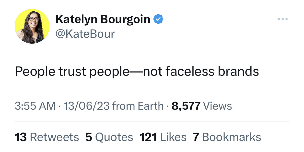
Even in today’s AI-driven world, human faces hold importance in marketing collateral —- especially when it comes to product videos. You can use your own face or the faces of your team members to build familiarity with the audience, gain their trust, and give your brand identity.
Popular brands are most commonly renowned by the identities of their owners/stakeholders. For example, Apple’s Think Different campaign remains as popular as ever, not only because of the message but also because of the people.

In the modern marketing sense of the world and for a more product video-specific example, you can consider looking at Bigbasket, an Indian eCommerce brand. Their product videos often use the same folks to promote their content.
.png)
And people really seem to like these videos, too. Case in point:
.png)
So, now that we’re convinced of the importance of adding human faces in product videos, here’s how to do it correctly:
Eye gazes are important because they tend to guide the reader where to look. For example, if someone’s eye gaze looks towards a product, chances are, the reader’s line of vision will follow the same direction, too.
This is something Katelyn Bourgoin of Why We Buy preaches, too. According to her, an eye gaze should be pointed at your biggest value proposition. For reference, here’s a snapshot of her website where her eye gaze is situated toward her USP.
.png)
Have you ever watched Friends (or any other popular 90s comedy show?)
If you have, quick question for you: have there been a couple of places where you didn’t understand what the joke was? But you knew there was something funny going on solely because of the laugh track in the background?
Well, you weren’t alone. The laugh track was specifically put in place to signal to you that you’re supposed to laugh at this scene because it's meant to be taken in a comedic way.
You can use the same theory to signal to our audience what emotions they should be feeling when they look at your product. However, instead of using laugh tracks, you can use faces to illustrate emotions.
It’s quite likely your audience will try to replicate the emotions they see the person at the other end of the screen feel. For example, if Person A in a product video is happy to see your product, it will signal your audience that they’re also supposed to be happy.
Pro Tip: You can also include background sounds in your product videos, too.
Remember how we spoke about faces imbibing a sense of familiarity? Well, another way to imbibe the emotions of familiarity and relatability is to use a diverse set of people and features.
Why, you ask? It’s quite simple, actually —- we all look different, act different, speak differently, and have different experiences and diverse features.
In today’s day and age, more than 1/5th of customers prefer to discover products through social media.
And if your audience happens to be Gen Z or Gen X, the number tends to be even higher —- with more than 41% of Gen Z and Gen X customers preferring to use social media to find new products.
These stats lead us to believe that a good chunk of our audience is making purchase decisions because of social media, so it makes sense to invest in those channels, particularly through shoppable videos.
What are shoppable videos, you ask? Well, because they help reduce friction between discovering the product and buying the product by directly taking you to the link.

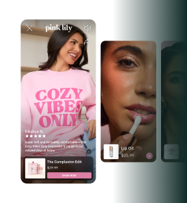
However, the use cases of shoppable videos are not only limited to social media channels, but you can use them on all types of channels, including websites. Here’s an example of a shoppable video Immi made through Videowise:
.png)
Nick Kolenda even studied
A brand’s UI/UX can make a world of difference, and one of the most prominent differences comes in the way of fonts.
Ideally, your fonts should correlate with your product. For example, if your product has a fancier feel to it, you should use fancy fonts. If it’s slim, use slim fonts. Nick Kolenda even studied the click-through rates (CTR) achieved using the same principle.
.png)
His study also stated that different font styles can convey different emotions, too. For example:
So, if you’re creating product videos that have written text, you can consider the associations behind certain fonts to improve your CTR. For example, if you’re creating a video ad for a mobile phone whose USP is battery reliability, maybe you can use straight fonts.
The fact of life is that people trust people with more authority and experience than them. This is also known as authority bias.
Authority bias is a phenomenon that has been ingrained in us since our childhood (e.g., as children, we have been taught to listen to elders, parents, and teachers), and anytime we assume someone has more authority or experience on a subject than us, we’re more bound to listen to them.
But the million-dollar question remains: how to use authority bias vis-a-vis product videos?
Well, you can show celebrity or influencer endorsements, insights from subject matter experts (SMEs), awards you may have received, and positive feedback you may have gotten from competitors or expert organizations in an industry.
In sum, you can use anything that helps the reader instill faith that someone who is more knowledgeable on a subject than them has also trusted your product and its capabilities.
For example, cosmetic brands like Huda Beauty often collaborate with beauty gurus to promote their upcoming/current products.
.png)
Allbirds
If there’s one takeaway you wish to remember from this blog, let it be to use social proof. This is because anytime your customers are about to make a purchase, they want to be assured that this purchase will deliver on its promise and it's worth the money they’re spending.
Consider two dermatologists as examples. One of them has social media pages but no presence on any page. Their clients haven’t posted anything about them, and you, as a reader, don't know of the before and after results the doctor has achieved.
The other doctor, on the flip side, has glowing reviews on almost every social media platform. And along with that, they also have images of certifications and awards they’ve received and before and after results they’ve achieved.
Keeping all things equal (e.g., experience, location, fees, and area of expertise), which doctor are you more likely to visit? Our guess is doctor #2 because you’re equipped with more proof of their competence and performance.
In the sense of product videos, you can use awards, certifications, before and after results, case studies, testimonials, names of other clients, etc., as a form of social proof.
Think of all the product videos that go like, “Trusted by teams from Famous Company A, Famous Company B, and Famous Company C” —- that’s what you want to replicate.
Just to give you an example, here’s an Allbirds product video that uses the “before and after” storytelling technique:
.png)
MakeWebBetter’s
A study conducted by HubSpot stated that calls to action (CTAs) which are more specific and action-oriented, saw conversion rates boost up by 202%. But, as trusted as HubSpot may be, let’s look at the results achieved by other folks who used actionable CTAs:
.png)
So, we can safely assume that although these different companies got different amounts of positive results, they all lead to one conclusion —- it’s time to ditch the generic CTAs like “Click Here” and “Know More.”
Instead, try to correlate your CTAs with the direct or indirect advantages your customers might get after they purchase your product. For example, you can consider alternatives like “Improve your conversions up to 50% with [brand name],” or “Download this guide to [value proposition].”
Here’s a real-life example of an eCommerce brand, Myntra, using a CTA that correlates directly to the advantage the customers would get after purchasing their product.
.png)
Image Source
Before we move to the next section, it must be noted that all the CTA examples given pertain to blogs/website content and not videos. But, there is enough reasonable doubt to imagine that replicating the same strategy for producing video content might get similar (if not the same) results.
A common writing advice most writers get is to ditch all the fear tactics in their writing when trying to convert a client.
Basically, instead of leading the reader towards all the bad things that could happen to them if they don’t use your product (e.g., “You might end up losing money if you don’t use our product,” or “Imagine the health risks you’ll be susceptible to if you don’t end up buying our insurance”), paint a positive picture for them.
For example, the same statements can be shifted to “You’ll save $XX if you end up buying our product” and “You won’t have to worry about money hassles in emergencies if you buy our insurance today.”
While this may not be specific to eCommerce, a real-life example of this is how medicine brands show people running happily in the summer sun instead of showing the crippling effects of not buying their product.
In marketing, specificity is key. Instead of just giving generic statements in your product videos like “Our product will help you save downtime” or “Our product will automate tasks,” you can consider using specific examples or concrete data.
For example, consider alternative statements like “Reduces downtime by 50%,” “Increases productivity by 20%,” or “Our customers saved 1000 hours in total after using our product.”
Here are a few directions of specificity you can look at when convincing customers to purchase your product:
Touching upon customer pain points tells your customer you know their product and you’re not just another armchair commentator just dishing out advice.
It would be even better if you could share a tiny tidbit about your experience before you showcase why you know your customer's pain points because you’ve personally experienced them.
For example, “I was a product manager before I created this product, so I know the specific pain points A, B, and C you’re going through, and this is how the product can address all those pain points.”
An excellent example you can look at is this product video by the eCommerce giant Shopify, which touches upon customer pain points first and then introduces the product.
.png)
Ryan Law
The last tip for the day would be to use the same language as your customers. This is because if you stick to the same tonality, words, and phrasing as them, they’ll consider you as part of their inner circle.
Ryan Law has given this advice in his How to Write Thought Leadership Content course too. He said that if you’re marketing to a specific kind of audience (e.g., marketers), you’ve got to start using jargon with them to signal to them that you, too, are part of the same circle as them.
For example, if you’re targeting marketers, you’ve got to assume they know simple jargon like CTA, SME, CTR, etc.
You can get a better handle on the language your customers speak by:
While there are thousands of other product video tips that can be shared (e.g., using some color schemes over others to capture audience attention or trying to use urgency tactics to get your customers to click on the first trip), this seems like a good place to stop this article, and instead focus on what we can do for you.
If you’re an eCommerce company that wants to create interactive videos for your audience, or if you want to speed up the time between product discovery and purchase during a product’s lifecycle, we’re here to help you do that through shoppable videos.
In fact, we’ve helped some of the biggest eCommerce brands on Shopify (e.g., London Lash, Zena Skin, Space Goods, etc.) make shoppable videos that have increased their engagement rate by four times more and improved their conversion rates by 21%.
Just take a look at what Immi, one of our customers, has to say:
.png)
So, if you wish to get similar results as Immi, book a demo with our team!

Video is one of the most effective tools for increasing Shopify sales. Brands using Videowise have seen conversion rate improvements of up to 328% and ROI increases of 50x. Product videos help shoppers understand what they are buying, build confidence, and reduce purchase hesitation.
The most effective tactics include adding product demo videos to product pages, using shoppable videos that allow cart-adds without leaving the player, featuring UGC video testimonials, creating how-to or tutorial videos, and using video in email campaigns to drive click-through rates.
Shoppable videos, product demos, and user-generated content (UGC) videos consistently convert best on eCommerce stores. These formats build trust and authenticity while showing the product in real-life use, which is far more persuasive than static imagery alone.
The results vary by brand and strategy, but case studies have shown extraordinary results. Brands using Videowise have generated over $600K in revenue attributed directly to video marketing, with conversion rate increases of up to 328% and ROI improvements of 50x.
The highest-impact placements for video on Shopify include product detail pages (above the fold), homepage hero sections, collection pages as video thumbnails, and shoppable video carousels. On-page video near the add-to-cart button is particularly effective at driving immediate conversions.