Share
To break free from the monotony and enhance user interaction, we're excited to introduce a suite of improvements to our widgets. From Randomized Positions in Carousel to Navigation Arrows for Stories and Square format for Carousel overlapping & Highlighted, these enhancements collectively transform your content presentation for a more dynamic and engaging experience.
Bring a spontaneous order to your content with the Randomized Position in Carousel
Ever found your carousel displays becoming predictable, losing the spark of engagement?
To overcome the challenge of maintaining a dynamic and engaging carousel, we're thrilled to introduce the option for randomized video positions, ensuring an engaging and unpredictable user experience.
By implementing randomized positions, the content within your carousel gets a spontaneous order with each user interaction or page reload.
Our client, Equi London, strategically utilizes the Randomized Position in Carousel on their home page. Instead of a predictable carousel, Equi London's visitors experience a dynamic and engaging journey with each interaction or page reload. This innovative approach not only maintains the freshness of their carousel content but also encourages visitors to explore diverse content, fostering a sense of curiosity and engagement
Improve your storytelling experience with effortless navigation
Navigating through interactive stories on desktop can sometimes be a challenging experience. Users may face difficulties moving seamlessly through shoppable stories, disrupting the immersive experience and slowing down engagement.
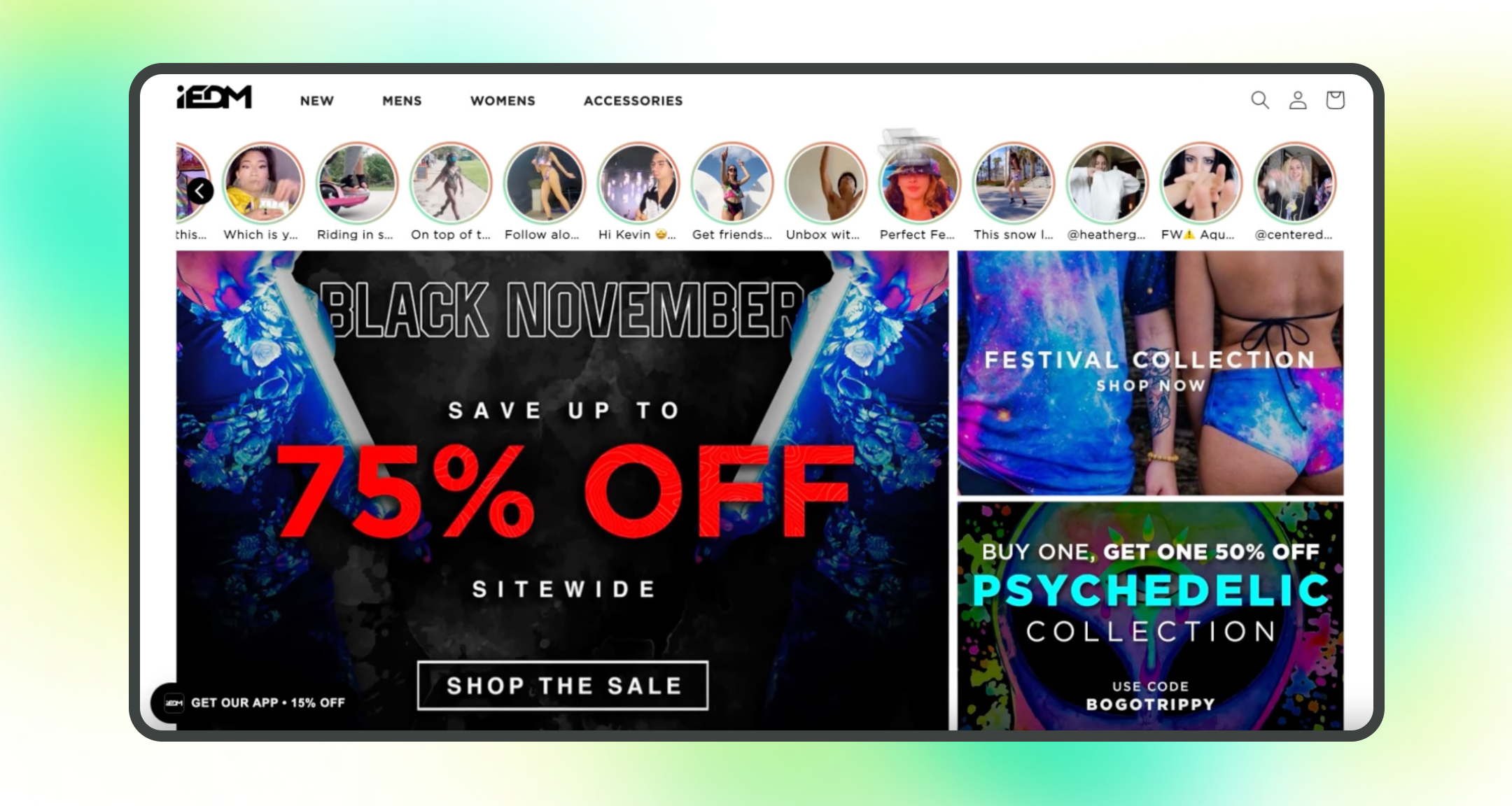
Our Navigation Arrows for the Stories Widget simplify the process for visitors, allowing them to move forward or backward with ease, and keeping them fully immersed.
Much like iEDM, one of our valued clients, who seamlessly integrates Navigation Arrows for the Stories Widget on their home page. This strategic use enhances the user experience, providing effortless navigation through interactive stories, ensuring uninterrupted engagement and a smooth storytelling experience.
Experience a more organized and visually harmonious layout with the "Square" format
Ensuring a visually harmonious layout in carousels with diverse content can be demanding.
To maintain a balanced and consistent visual presentation within your carousels, we're introducing the "Square" format for Carousel Overlapping & Highlighted components. This improvement allows you to transform thumbnails into a uniform square shape, offering a balanced and consistent layout for your carousels.
Check out how Shop Masc effectively uses the "Square" format for their Carousel Overlapping component, maintaining a visually harmonious layout in their diverse content carousel. By transforming thumbnails into a uniform square shape, Shaop Masc achieves a balanced and consistent presentation, creating an aesthetically pleasing experience for their audience.
That's a Wrap!
Implement these enhancements today by logging into your account and embark on a journey to create engaging content that captivates your audience like never before. If you're not already a Videowise customer, you can request a demo to get started with a free trial.
Share


.jpg?width=420&height=420&name=live%20shopping%20top%205%20fashion%20(1).jpg)