Share
The holidays are here (woohoo!) and that means eCommerce stores are frantically preparing for the intense shopping season. There are a lot of factors that can contribute to the success of your online store this holiday, today we are going to focus on how making changes to your site design can increase your engagement, SEO, and conversion rate.
White Space: Let your site breathe
The strategy behind white space when designing your online store is to highlight the most important information on a page, by leaving space in the surrounding areas.
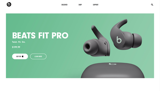
A great example of white space being used to feature a product is the header from Beats by Dre.
Look at the products and pages you intend to drive the most traffic to, or that are likely to see the most engagement.
You should be certain that these pages are perfect before the traffic starts pouring in.
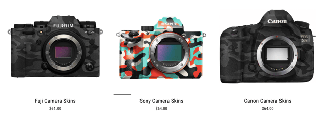
For example, take a look at how Videowise customer CAMSKNS.com uses white space to keep visitors focused on their products.
CAMSKNS.com sells high-quality camera, drone, and laptop skins for the photographer who wants to stand out in the crowd.
Color: Draw attention where it's needed most
Remember, color has meaning. Each color you use creates a natural impulse in your visitors, and can quickly develop the way someone feels about your brand or products.
Color has always been an important part of eCommerce site design, but in the interest of giving your store a fresh coat of paint for the holidays, here are some tips to making changes that boost your sales.
Red
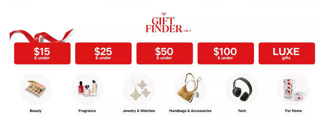
Macys.com uses red to highlight their most popular 'gift' items and separates them by price. This helps visitors find what they need faster and gets them to check out faster.
Red is one of the most stand-out colors for any website, often associated with discounts, clearance, Christmas, and warmth. Red should be used sparingly (otherwise it's less impactful) throughout your site to highlight the most important parts of each page. The underlying meanings for red are energy, attention, and fervor.
Green
Green is of course also a holiday color, generally representing positive actions and reactions. The underlying meanings for green are harmony, reliability, and sustainability.
Use this color to support your holiday well wishes, and where customers are naturally looking for value. (reviews section, about page, areas where you tell your story)
Blue
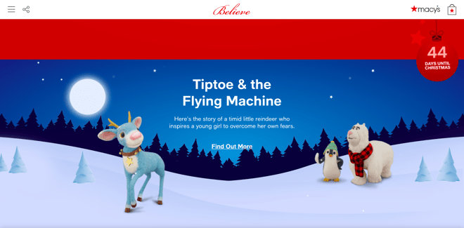
A great example of using blue in design for your store is once again, Macys.com which uses it to highlight a meaningful story and build excitement for an upcoming event.
Blue is the unsung hero of the holiday season.
It is often used as a background for holiday-themed sites, or other accents here and there.
Blue represents confidence, responsibility, trustworthiness, and balance. With the addition of other holiday details, it can quickly remind users of winter/snow.
While blue is not an amazing color to use for highlighting important information, it is a great option for adding some calm to the storm. Your site should have a balance between high contrast, attention-grabbing colors, and low contrast colors that add to your site's overall feel.
To quote H. G. Wells "If anything is possible, then nothing is interesting.".
This is true with design as well, don't give your customers too many options, make it very clear what action to take on every page.
You have to find a balance in your site design, take advantage of the opportunity to excite visitors with a unique holiday shopping experience, and they will buy from you again and again.
To really add firepower to your Shopify store's web design, an eCommerce agency team such as Charle can be used to take your store to the next level.
Video: create a better in-store experience that sells
Video is the highest performing form of media that you can use in marketing your store, you're likely already using it in most of your ad campaigns.
In 2020, 96% of consumers increased their online video consumption, and 9 out of 10 viewers said that they wanted to see more videos from brands and businesses. In fact, as of 2022, an average person is predicted to spend 100 minutes per day watching online videos. (invideo)
Therefore it's no wonder why Shopify store owners are innovating this holiday by incorporating apps like Videowise, that engage, and convert users with video.
Let's go over some of the best practices you can use to turn visitors into customers this holiday.
Video Reviews
Image taken from AxelGlade.com, they've used Videowise to increase their conversion rate & boost their SEO.
Reviews are one of the most important aspects of a product page, they provide universally recognized social proof for your product. Video reviews/testimonials/unboxings are proven to increase conversions, average session time and boost revenue.
According to the data that we've gathered from the Videowise customer database, shoppable video reviews convert 3-5x higher on average than text reviews/testimonials.
Influencer Generated Videos
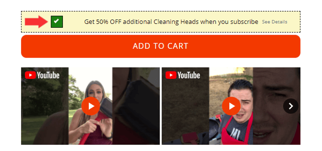
Image taken from GrillRescue.com, they've used Videowise to add influencer videos and testimonials that boost conversions and add social proof to their product pages.
Lots of businesses are investing in influencer content, especially for the holiday season. Influencer campaigns can cost millions of dollars, and content on platforms like Instagram or TikTok have very short lifespans, and you can stop seeing returns as early as 24 hours.
To make that content last longer, and continue to contribute towards your growth, place it on your stores' product pages. By adding influencer content to your product page, you can make its effects last forever.
Product Presentations & More
Camskns.com uses vertical shoppable videos to create product presentations, how-to's, and offer video testimonials.
Images and text are not always enough for the value of a product to be clear. This is especially so the more niche, or original your product is.
It's even becoming common for product videos to be displayed in the main product carousel, but these are often featured at the end, and rarely get watched.
By adding how-to videos, and product demonstrations right next to the add-to-cart button, the videos stand out more and are engaged with often. Customers who engage with video are 4-6x more likely to convert during that session.
Video Shopping
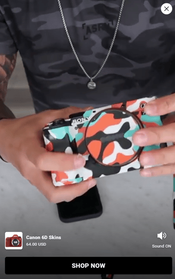
Video shopping is still new to the
eCommerce space, and can only be achieved with some savvy coding skills, or advanced 3rd party apps like Videowise.
Apps like Videowise give store owners the opportunity to convert a normal video into a shoppable video with ease.
It's important to make sure that the design of your video player and your shoppable UI match your brand, your site, and any holiday promotions you might be doing.
Create a start to finish shopping process with video, it's the most engaging form of media, and is proven to be the most likely to influence a customer to convert.
Funneling your store traffic through the mediums that have the highest conversion rates is the roadmap to holiday success.
Video shopping is still new to the eCommerce space, and can only be achieved with some savvy coding skills, or advanced 3rd party apps like Videowise.
Apps like Videowise give store owners the opportunity to convert a normal video into a shoppable video with ease.
It's important to make sure that the design of your video player and your shoppable UI match your brand, your site, and any holiday promotions you might be doing.
Create a start to finish shopping process with video, it's the most engaging form of media, and is proven to be the most likely to influence a customer to convert.
Funneling your store traffic through the mediums that have the highest conversion rates is the roadmap to holiday success.
Share

.jpg)

.png?width=300&name=Untitled%20design%20(3).png)


.jpg?width=420&height=420&name=live%20shopping%20top%205%20fashion%20(1).jpg)