
Product pages can make or break your earnings. A great user experience on your product page can have a positive impact on your sales, and a bad one can turn customers away.
In this article, we’ll cover some of the best product page practices for eCommerce businesses to help you make your product pages even more compelling.
Let’s get started.
Product descriptions are one of the most important segments of your product page.
A great product description includes the product features, its benefits, different sizes, color options, and more. Depending on what your product is, this section can also include the materials, assembling instructions, how to take care of the product, and anything else that’s relevant to what you’re selling.
Here’s an example of a product description from Busy Baby Mat:
This product description includes the three main benefits of using the Busy Baby Mat products, with images to create visual breaks. In the second section, the description includes some information that the buyers of these products (most likely parents) care about. For example, it’s dishwasher safe, meaning it’s easy to take care of, and it’s made out of food-grade silicone, meaning that it’s safe for their kids to use.
A great product description should include everything that the customer needs to know to enjoy using the product. Once you have all of that in place, you can spice your descriptions up with some persuasive language.
It’s important to note that your descriptions should be honest and trustworthy. Using persuasive language doesn’t mean being deceptive about the product. It simply means spicing it up a bit.
In the example above, Busy Baby Mat uses persuasive language to communicate how their product solves the users’ problem (no more having to clean up splashes of milk, juice, and formula off the floor).
When you write the product description, it can be easy to overlook the SEO factors that are important. Following best on-page SEO practices is essential for your page to rank in search results, and for customers to find you.
For your page to rank, you’ll need to be including relevant keywords throughout your page. In many cases, the keywords you’ll be targeting will be related to the product you sell (for example: buy a stand-up paddle).
However, if you’re not sure what keywords you should target, we recommend you learn more about keyword research before optimizing your pages.
Once you know the keyword you want to target, you should mention that keyword in:
The mentions of the keyword should sound natural to the reader, and be added to places where it makes sense to mention it.
Let’s have a look at an example from Apolla, a sustainable footwear brand.
The keyword they’re targeting is “ankle compression socks,” and on this page, we notice that they used the keyword in the URL, the subheading, and the breadcrumbs navigational link.
If we scroll down to the description, we can see mentions of the keyword and its’ variations throughout the next.
Do you know that 65% of people are dominantly visual learners? This statistic isn’t only important for teachers and educational companies, but also for eCommerce companies. A lot of customers make the decision to purchase based on what they can see.
You can give your potential customers a chance to get to know the product before buying it with high-resolution images, and a 360° overview. These features can also include close-up views of the product, and zoom-in/zoom-out options.
If you want to take it a step further and delight your customers, you can add pictures of how the product can be used in real life. IKEA, a home furnishing brand, mastered this game, so let’s have a look at one of their pages.
They start off with a basic image of their product:
Then give you the 360° view of the product:
And then, they spice it up with some amazing examples of how to use the product. It makes it easy for the customer to visualize the product in their (dream) home.
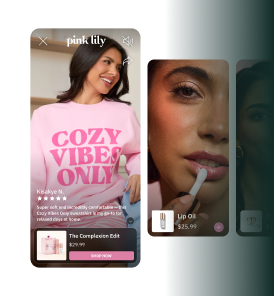
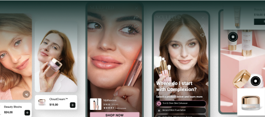
Implementing shoppable videos is a great way to take the visual experience to a new level. Videos add an extra layer to experience the product before actually buying it.
These videos can be customer testimonials, interactive videos where customers can buy the product directly on the video, and more. One of the main challenges of implementing video on your website is that it can sometimes slow down your pages.
That’s where a platform like Videowise can help you. Videowise’s Player helps you engage and convert viewers while providing fast streaming. Here's an example of how MASC used a single video carousel to generate $130k.
They used videos to enrich their product pages in several different sections. Below the product description and images, they introduced a Help Section that answers any potential questions a viewer might have.
As you continue down the page, you’ll find videos in reviews.
And in the FAQ section, along with a widget to add the product to the cart.
The description, images, and videos are all great things to include in your product pages. But, there’s one thing that customers love to see – the reviews and opinions of other people.
By including reviews on your website, you’re building a relationship of trust with potential customers. You’re giving them a glimpse into other people’s experiences with your product.
For example, Decathlon, a sporting goods retailer, has a review section for each of its products. Customers can leave honest reviews directly on their website, both good and bad ones.
Some companies may be afraid of getting negative reviews, directly on their store. However, they can have a positive impact on your trustworthiness. First of all, customers know that no product is perfect, and you’re sending them a message that you have nothing to hide.
If the customers know about the products’ flaws before they purchase them, they won’t be dissatisfied later on. They knew about the flaw and still decided to buy it.
In this example, Decathlon goes a step further and provides customer support right there in the reviews. This gives you a unique opportunity to address potential issues right there in the reviews.
You can personalize the shoppers’ experience by adding user-generated content to your page. Skullcandy used Videowise to deploy shoppable UGC carousels across four regional stores, driving a 7.9% RPS increase, up to 5% CVR uplift, and $120K+ in post-video revenue in under a month.
When your potential customers are looking to buy something online, they’re likely looking at many other products and websites. Your product pages need to be so good that the customers want to purchase what you’re selling right away.
You can do that by creating a sense of urgency. Some examples of that may be:
Let’s have a look at how Booking, an online travel marketplace, does this. We’re searching for a place to stay in Mykonos. In the search results, they use these things to create a sense of urgency:
Once you go to the product page, they repeat the same information (free cancellation, only 1 left on their site). In addition to that, they add two new sections:
When customers can’t find the information they need about your product, they’re likely to leave in search of better options. In fact, the average bounce rate is more than 50%. You can reduce the number of potential customers that leave by enabling a live chat option for them to communicate with your team directly.
They may have questions before they make a decision or after the purchase about your returns policy, and similar. There are many options for live chat integrations. You can choose whether you’d like to have a customer support team answering these questions, an AI chatbot with built-in answers, or a mix of both.
Having a live chat on your product pages can help you retain customers. Here are two great examples of how a chat can help you land more sales.
The first situation is when you’re out of stock for a specific product, but it’ll be available soon. You can guide a customer to pre-order a product that’s currently unavailable.
Let’s have a look at a similar situation where a product isn’t available at all anymore. In this case, you can use live chat to suggest other similar options.
In both of these cases, you’re reducing the chance of them going to another place to find what they’re looking for, and increasing your conversion rate.
There’s nothing worse than going through a checkout process, only to be met with 4 additional fees, and a price that’s significantly more expensive compared to the one listed on the product page.
This kind of user experience will increase the bounce rate in the late stages of the purchase process when you’re so close to selling the product. You can avoid this by being honest and transparent about the cost of your product.
If you offer a deal or a discount, include it right away so that the customer knows they’ll be paying less. You can go a step further and visually show the price difference between the old and the new price.
Let’s have another look at Booking. When you choose a property you’d like to stay in, you’re shown a price. It shows how much you’ll be saving and paying.
Once you get to the end of the checkout process – the price doesn’t change, so there are no unpleasant surprises.
What are your shipping and returns policies? As an eCommerce brand, we’re sure you have them, and so are your potential customers. Instead of making them go through your entire website and checkout process to find them, why not make it accessible on the product pages?
Nobody likes adding stuff to the cart, only to find out that shipping is more expensive than the product they want to buy. It’s a bad experience for them and a lost sale for you.
Here’s how Zalando, an online fashion retailer, provides a nice overview of its policies.
Customers can easily see what options are available, and they can choose what fits their needs the best.
If you have a great shipping and returns experience, why not talk about it on your pages directly?
While you’re working on an amazing user experience for your customers, you should test different options out until you find those that work best for you.
The most successful eCommerce brands regularly update and improve their stores, based on new information they learn.
By implementing some of these best eCommerce product page practices, you have a chance of delighting your customers and standing out from the competition.
Don’t forget to try out some of Videowise’s features for creating amazing shoppable videos. Book a demo to see what our tools can do for you!
The best product page practices for 2026 include fast load times, high-quality video demos, authentic UGC testimonials, clear benefit-focused copy, mobile-first design, easy variant selection, prominent add-to-cart buttons, and social proof displayed near the purchase decision point. These elements together maximize conversion rate.
A great product page UX directly increases conversion rates and average order value. When shoppers can easily understand the product, see it in action, read authentic reviews, and check out smoothly, they are far more likely to complete a purchase. Small improvements to product page UX can translate to significant revenue gains.
Video is now a core best practice for high-converting product pages. A well-placed product demo video can increase conversion rate by 20-80%. Shoppable video carousels and UGC testimonial videos address different buyer hesitations and provide the visual confidence modern shoppers expect before making a purchase.
Mobile optimization is non-negotiable in 2026. More than 60% of eCommerce traffic comes from mobile devices, and product pages that are slow, hard to navigate, or display video poorly will lose a significant portion of potential revenue. Fast-loading mobile pages with touch-friendly design and optimized video are essential.
Product pages should be reviewed and updated regularly - at minimum quarterly. Add fresh UGC video reviews as they are collected, update copy based on customer questions and feedback, test new layouts, and refresh video content to reflect current trends. Active page management consistently outperforms a set-and-forget approach.
1. Write clear and detailed product descriptions
3. High-quality images of the product
5. Customer reviews and testimonials
8. Transparent pricing information
9. Information about the shipping and returns policy


.jpg)
.jpg)
